Monday, 26 March 2012
Style Example for Dynamic Com.
Saturday, 3 March 2012
Boxing Gym Environment
I've been working pretty solidly on modelling my 3D environment, as you can see from my last 3 or 4 updates, and I am pretty much finished the modelling side. All I need to model is a door to the gym and some lights on the roof, then I will be able to get on with texturing and lighting everything. Anyway, here are my renders of my environment. I am keeping all the walls and that basic to reduce polys, also the texturing will be what makes them stand out I think.
Friday, 2 March 2012
Boxing Bag Model
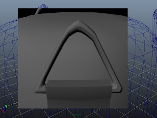
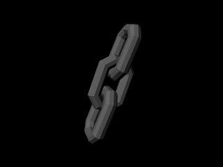
For my punch bag I was wanting to keep them quite low poly. However this didn't happen as such. By the time I added in the chains and made the bag smooth, they got quite high. But with all the polys on the bag I think I will add a lattice to make the bag more bumpy, so it looks more like it's been punched a lot.
Above: I did think about smoothing these triangle chain bits, but They will not be a main focus at all so it would just be unnecessary polys and I want to keep the number of polys under control.
Boxing Ring Modeling 2
I have just done some further development on my boxing ring, I have made the corner pads and straps to keep them attached. The straps were probably not so necessary, but the ring is going to be the main focal point of my scene and I therefore want it to look as good as possible.
Wednesday, 8 February 2012
Takashi Okazaki
I just recently remembered about an artist whos work I really like. That artist is Takashi Okazaki. He does manga art in a really dark way and his work is also really detailed too. He is most known for his work form the series Afro Samurai and below are some images from this.
Friday, 3 February 2012
Dynamic Communications & Visual Literacy Mood Boards
Visual Literacy mood board. Work from J.R. Hogarth, artist for game Bioshock.
Visual Literacy & Dynamic Communications mood board. This is artwork from Frank Miller and is a style I may choose for either Visual Literacy or Dynamic Communications. I have not decided yet.
Mood board for Dynamic Communications. I was thinking of possibly going more down the route of 300 (like the style of Spartacus too)
Sunday, 29 January 2012
Dynamic Communication
For my story I want to go for a Roman era style. It will be inspired be the series Spartacus and the movie 300. I'm choosing this style as it will work really well for the ideas I have in my head at this point in time, e.g. the slow motion parts where the objects within the scene aren't moving but the camera is, that is what I want to do (however I will simply have 2D images but with different objects moving at different speeds to show depth)
Above is a mood board of images from Spartacus and 300 as this is the style I am wanting to go for.
Here are some You Tube links to show where my inspiration has come from:
http://www.youtube.com/watch?v=Z89E0dAUeHo
http://www.youtube.com/watch?feature=player_detailpage&v=JssUoIEAyuY#t=14s
Note: Just this style of camera movement where the objects within the scene don't move
Wednesday, 11 January 2012
Flour Sack Digital Storyboard
I did want to add this to my disc, however I was not able to because the computer would not allow me to remove anything from my disc and the computer would also not even register any other disc I attempted to use instead. So this is my digital storyboard for each individual scene in my animation. Sorry for the inconveniance.
Sunday, 8 January 2012
Friday, 6 January 2012
Vis Lit: Task 2
For my second task in Vis Lit I had to find a piece of text and come up with a character and an environment for that piece of text. The text I picked was the song Fallen Leaves by Billy Talent. I think this song is relating the fallen leaves to those who have fallen from grace, due to drug addiction (it is definitely somewhat about drugs). "Fallen leaves on the ground" refers to the addicts and how they started off healthy at the top of tree and began to fall when they got addicted, slowly dying, just as leaves do when they fall to the ground.
My first image, the character, is meant to symbolise the fall from grace. On the left is what could have been, a well respected successful man and on the right is the fallen, a drug addicted waster. The skin is purposely more of a grey colour on the right to show the lack of good health and the fact he is dying. The background also has meaning, it represents, on the left, a nice pure blue which fades into a dark scummy green over the addicts side.
My first image, the character, is meant to symbolise the fall from grace. On the left is what could have been, a well respected successful man and on the right is the fallen, a drug addicted waster. The skin is purposely more of a grey colour on the right to show the lack of good health and the fact he is dying. The background also has meaning, it represents, on the left, a nice pure blue which fades into a dark scummy green over the addicts side.
The second image is my environment. It is made to look like a dark and dingy area where you would associate drug addicts and degenerates to hang out.
Subscribe to:
Posts (Atom)


